background
Virgin Mobile has two main value propositions. It’s “Member's” pay less for their service, and get rewarded with exclusive deals. Largely catering to youth, they offer deals on food, entertainment, fashion and travel.
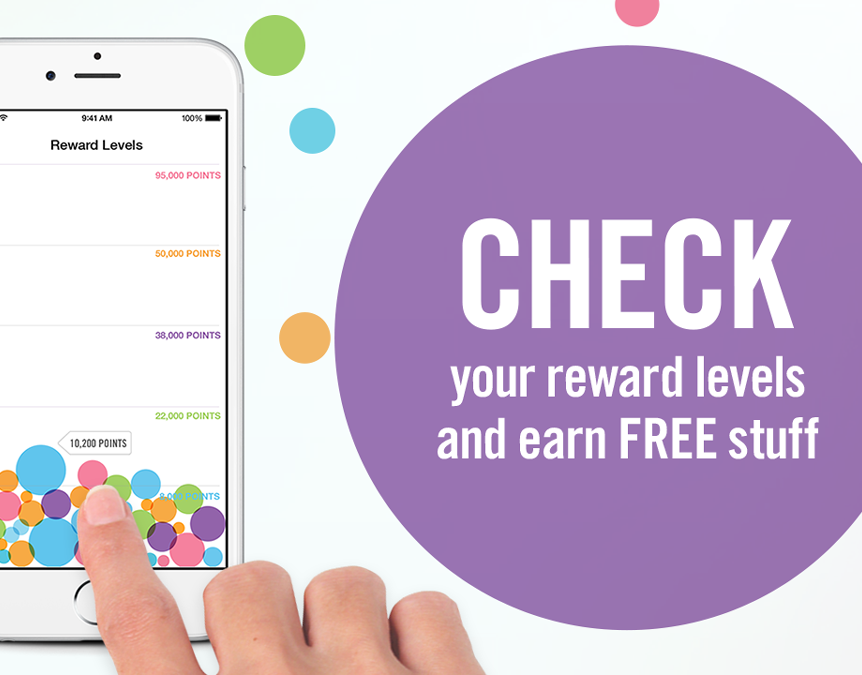
My Benefits” is a mobile app primarily for Virgin Plus Member’s. Its goal is to provide quick access to redeem offers, enter contests and discover new benefits on-the-go.
overview
Virgin Mobile Canada came to us looking to modernize, add features, and bring new life to an existing version of their app. They had some specific requests as to what they thought it was missing, but had yet to really connect with their users to validate their own assumptions.
They had also been custom creating promotions within a cumbersome method of system updates, tracking redemptions, saving and some other technology issues.
discovery objectives
- Validate and connect with users
- Clarify strategy and focus areas
- Narrow efforts for redesign and build
- Define scope and success metrics
- Clarify strategy and focus areas
- Narrow efforts for redesign and build
- Define scope and success metrics
research
With limited time for research, and client discussions being centred around target audiences, I decided to advise our team to conduct user studies.
We invited 3 groups to try the existing app. First group was people from our company, second current Virgin Plus users and the third a selection of students.
divide + conquer
After organizing the study, I assigned my junior designer and strategy to conduct it. This allowed me to do additional research and efforts that didn’t fit in the original timeline.
I started by absorbing countless app reviews, gathering UX examples, a mood board for the brand and UI, as well the beginnings of a component guide.
issues / pain points
- Navigation not organized, UI chunky & visually competes with offers, large carousel creating user friction.
- Users not exposed to the amount of offers available.
- Access to saved items & back-end slow.
- Time spent in app is generally low.
- Repeat usage limited, users access a single offer code and then usually abandon.
- Little data on amount of redemptions or contests entered, & no tracking in-store.
- Members have to fill offers out manually every time.
- Offers created ad-hock internally (sizes vary & text is imbedded into the image).
APPROACH
- Simplify navigation, create a minimal UI that doesn’t compete with offers
- Expose the breath of content, create the feeling of volume and make brands stand out.
- Move storage in-app, utilize server tokens & give fast access to saved items.
- Serve up a dynamic offer hierarchy, based on personalization, usage, and popularity.
- Utilize location based notifications & track response rates.
- Track in-app behaviour: items tapped, details viewed, & tag offers as redeemed.
- Show users the value of filling out profile information, utilize auto-fill & potentially give rewards for doing so.
problem statement
Members are not finding or utilizing the available value offered in the My Benefits app. They need to feel they have made the right choice with Virgin Plus Mobile.
success goals
1. Optimize the experience for speed & ease of use
2. Increase number of redemptions
3. Increase time spent in app
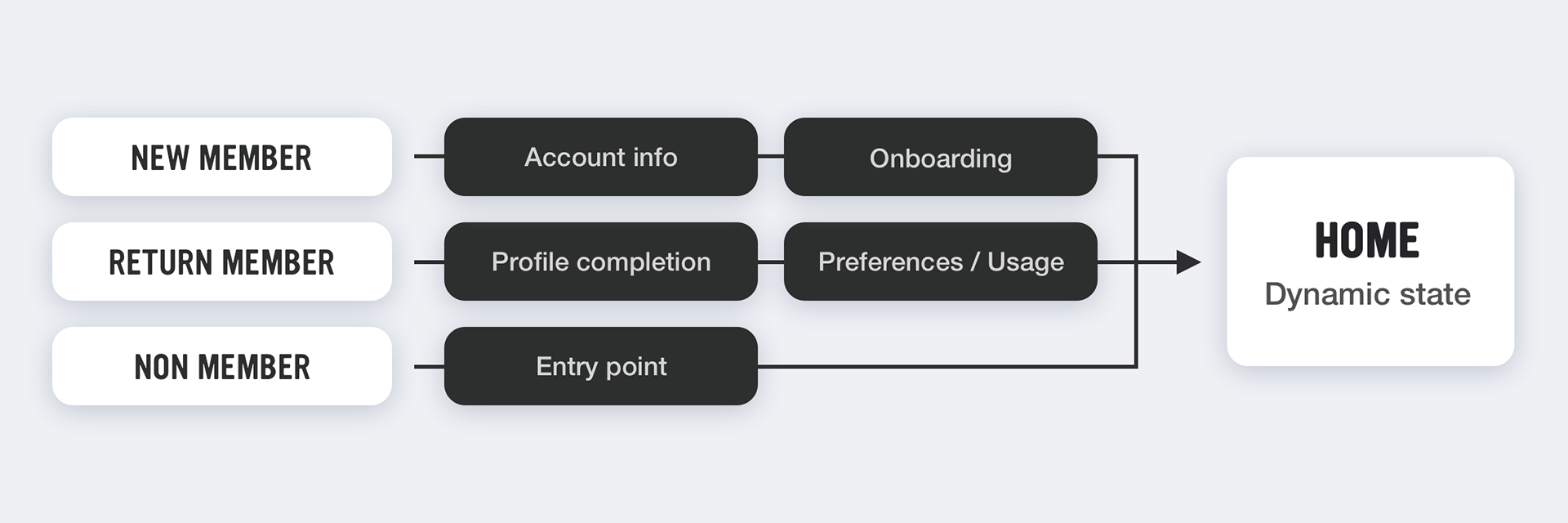
defining the flow
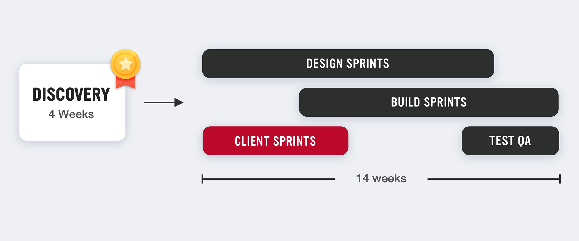
After a successful discovery stage we were now ready to move into ideation, design and build phases, getting to the meat of the matter. Key to this was to first dive into understanding entry points, access info from member accounts, how offers were created / updated on the backend, and then where we would store, use and track the new behavioural data we were planning on gathering. All of this would help to inform our user flows, designs, feature sets, approval/revision timelines and end testing.

design phase - create harmony
The first thing to address and get validation on, was the approach to the UI. Elements needed to be simplified and devoid of colour (except for the Virgin Mobile red) with a modern minimalist feel. It needed work in harmony with the experience, but also become almost secondary to the content. I developed a small reusable component guide to standardize items such as images, lists, and sections.
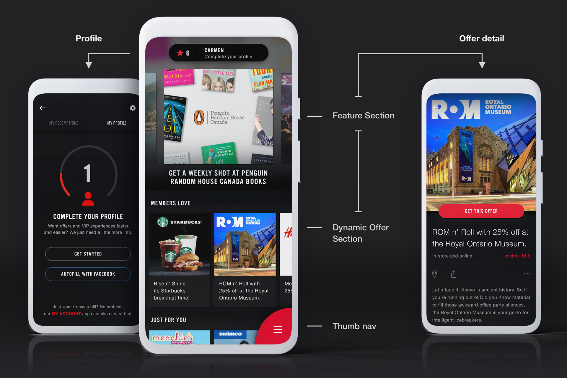
design phase - expose + Excite
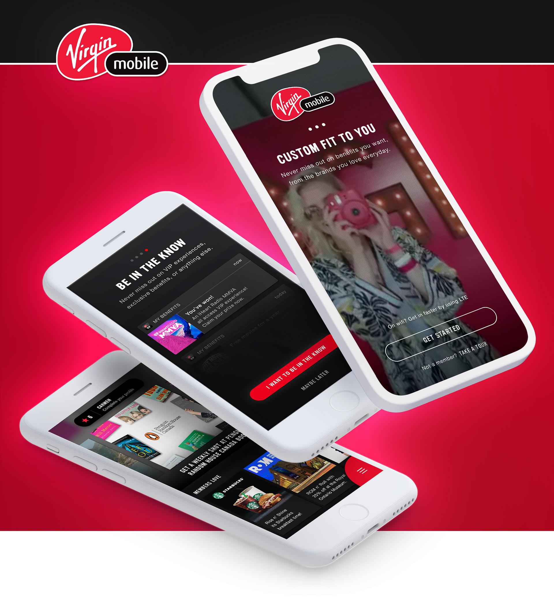
Defining the visual language and solving for the UI now gave me a solid base of design components. Now we could focus on how to accentuate the content further, create an air of excitement and a feeling of exclusivity. This became the main ideation portion of the engagement. As seen above, the Home screen redesign allowed for more exposure of content, a helper to complete profiles, and members could easily browse through offers and redeem faster.
First impressions
As the first screen users would see after launching the app, we saw this as a good way to immediately catch their attention and create some excitement. It made sense to use an existing video from a marketing campaign that people may already have had a connection with.

right/left at your thumb tips
Once we simplified and eliminated some previous items, there really wasn't that much left in the navigation. Seeing this an opportunity to further expose the content, and give a unique feature to the app, I introduced an interactive thumb nav, it could also be configured for a right handed or left handed person.
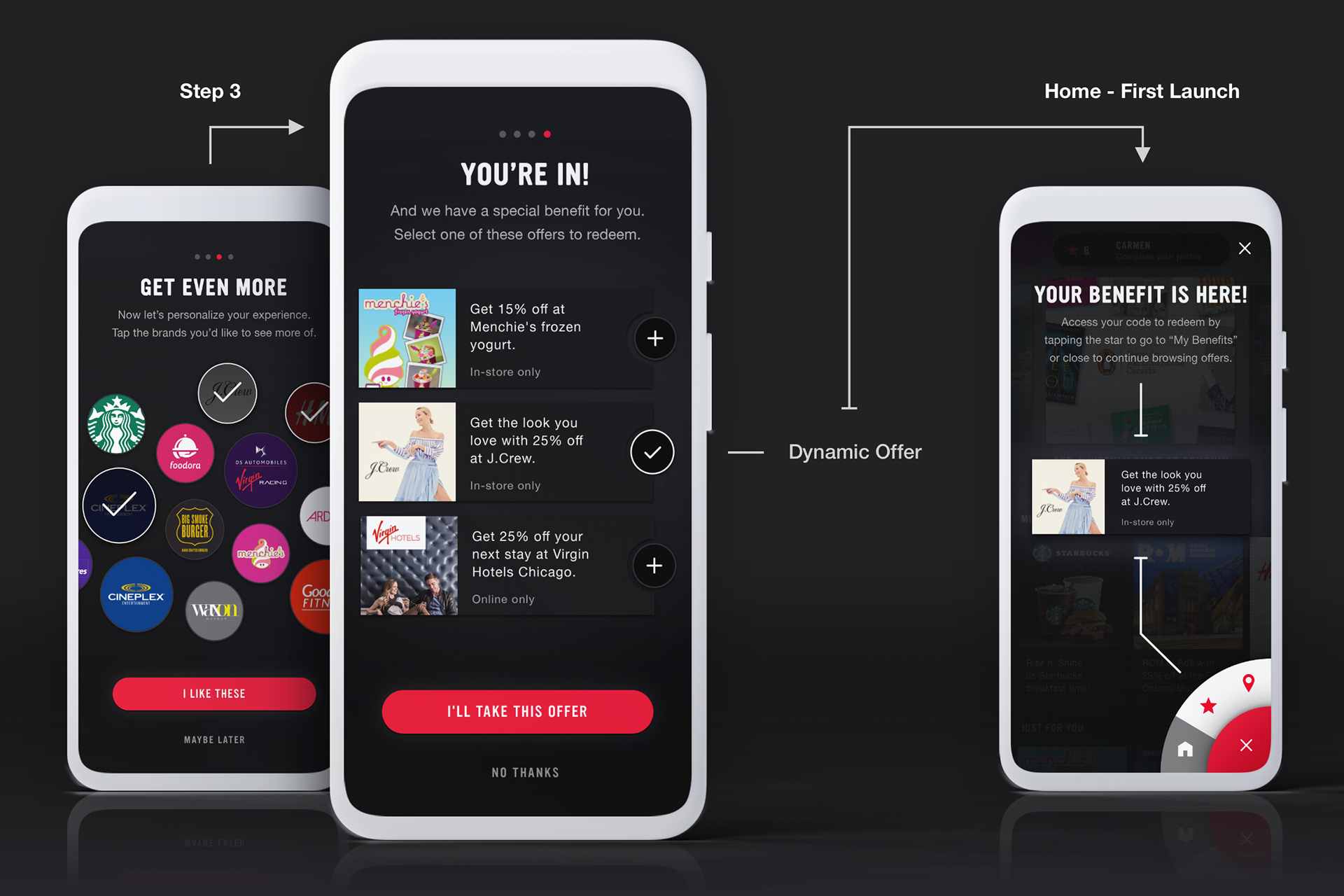
dangling a carrot
The idea was, “why not give member’s an offer right out of the gate”, expose them to content as soon as possible. We decided the best place for this was onboarding, a member would be presented an offer based on their preference selections or location, and given a sort of "reward" for completing onboarding. It also was an opportunity to familiarize them with the navigation by showing them on first home screen launch where this benefit was stored.
and then it launched
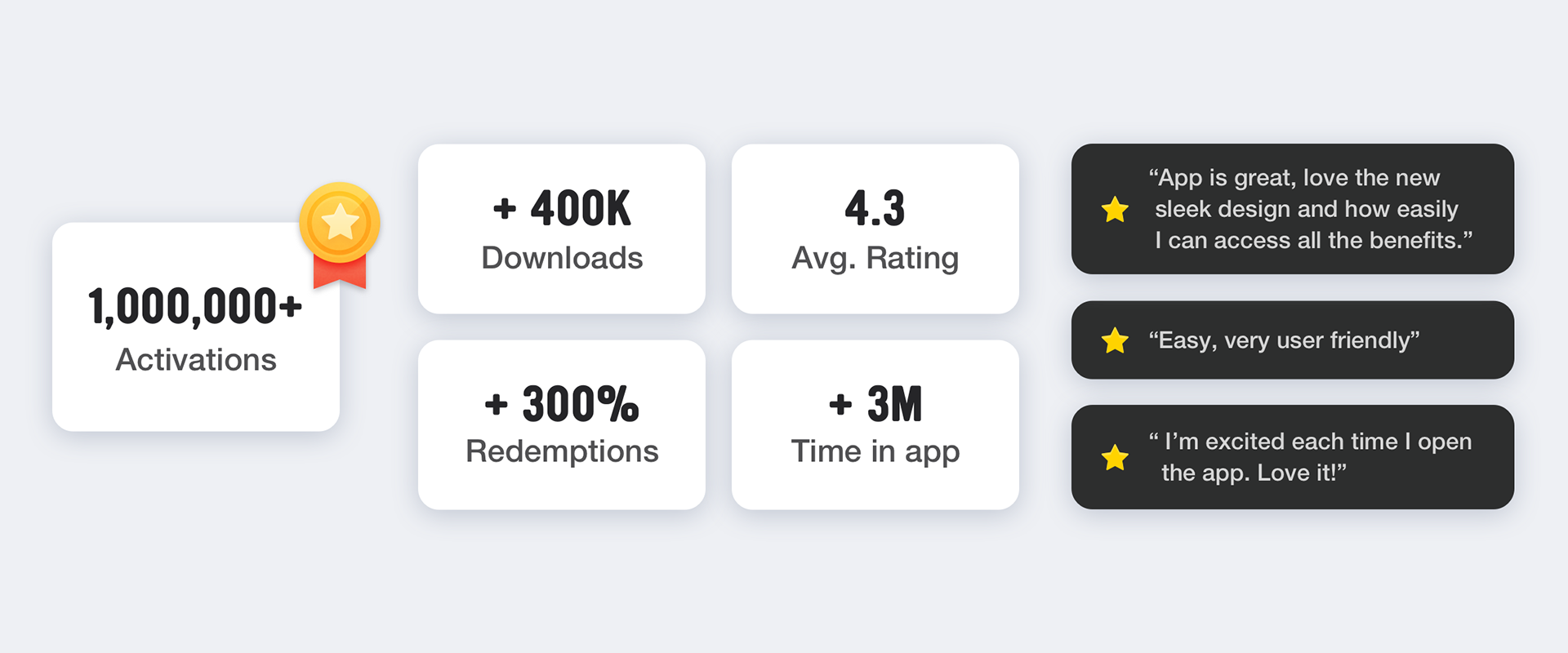
To our delight there was an overwhelming amount of new interest in the app, a huge spike in downloads and time spent in-app. Member feedback was largely positive and it didn’t take long for the internal conversations to at Virgin to start. It seemed that the app was largely ignored internally as to its usefulness from a business perspective, but now people were paying attention.
a tangible outcome
From a design perspective the component guide or design system became an adopted standard that filtered throughout the whole organization. In conjunction with standardizing common items, organizing their backend system, and tracking offers, Virgin could now create new content in a much more efficient way and had tangible performance measures to help with business decisions.
Gaining new member insight data meant they could serve up popular items, put more emphasis on ones that were not preforming well or remove offers that didn’t peak members interest. Having these metrics also allowed for them to obtain more brands and in turn offer member more exclusive deals.